Table of Contents
What is a Bar Graph?
A bar graph, also known as a bar chart, is a graphical representation of data that uses rectangular bars or columns to show the values of different categories. In a bar graph, the length or height of each bar corresponds to the quantity or frequency it represents. Bar graphs are commonly used to display and compare the values of discrete categories or groups.
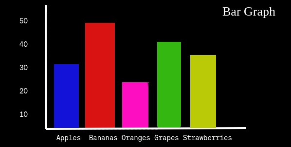
For example, Suppose you conducted a survey to find out people’s favorite fruits, and you collected the following data:
- Apples: 30
- Bananas: 45
- Oranges: 25
- Grapes: 40
- Strawberries: 35
Now, let’s create a bar graph to represent this data:

Elements of a Bar Graph
Bars
Vertical or horizontal bars represent the different categories or groups being compared. The length (in a vertical bar graph) or the height (in a horizontal bar graph) of each bar corresponds to the value it represents.
Axis
The graph has two axes—usually a vertical (y-axis) and a horizontal (x-axis). The categories or groups are typically shown along the x-axis, while the values are shown along the y-axis.
Title
A title at the top of the graph provides a description of the information being displayed.
Labels
Labels on the axes and bars provide context and help interpret the data.
Bar graphs are effective for presenting categorical data and making visual comparisons between different groups or data points.
Properties of Bar Graph
- Rectangular shapes representing data values.
- Vertical (y-axis) and horizontal (x-axis) lines for data reference.
- Marked intervals on axes for accurate measurement.
- Descriptive header explaining the graph’s purpose.
- Identifying text for categories (x-axis) and values (y-axis).
- Optional use of colors for distinction or emphasis.
- Key explaining colors or patterns used in the graph.
- Evenly spaced bars with adequate gaps for clarity.
- Vertical or horizontal alignment of bars.